Cowboy Fonts
OWEN EARL 30 November 2019
Makin’
★ DOWNLOAD THE ZIP! ★
Any self-respecting cowboy knows that design is an essential skill. How else would we write WANTED posters, or put titles on our cowboy albums?
At the center of good cowboy graphic design is good fonts. The more the better! Cowboys are known to put all sorts of big, bold, and varied fonts in all their design work. The bigger and the bolder the better! There’s no such thing as too many fonts on one cowboy poster! Fonts should roam as wild and free as the cowboy heart!
To help the modern cowboy designer get a head start on a good typographic tool kit, I’ve hand-selected some high quality cowboy fonts! All fonts in this pack are free to use for whatever fun projects you’ve got in store. Below is some information on the fonts and designers that made them!
-
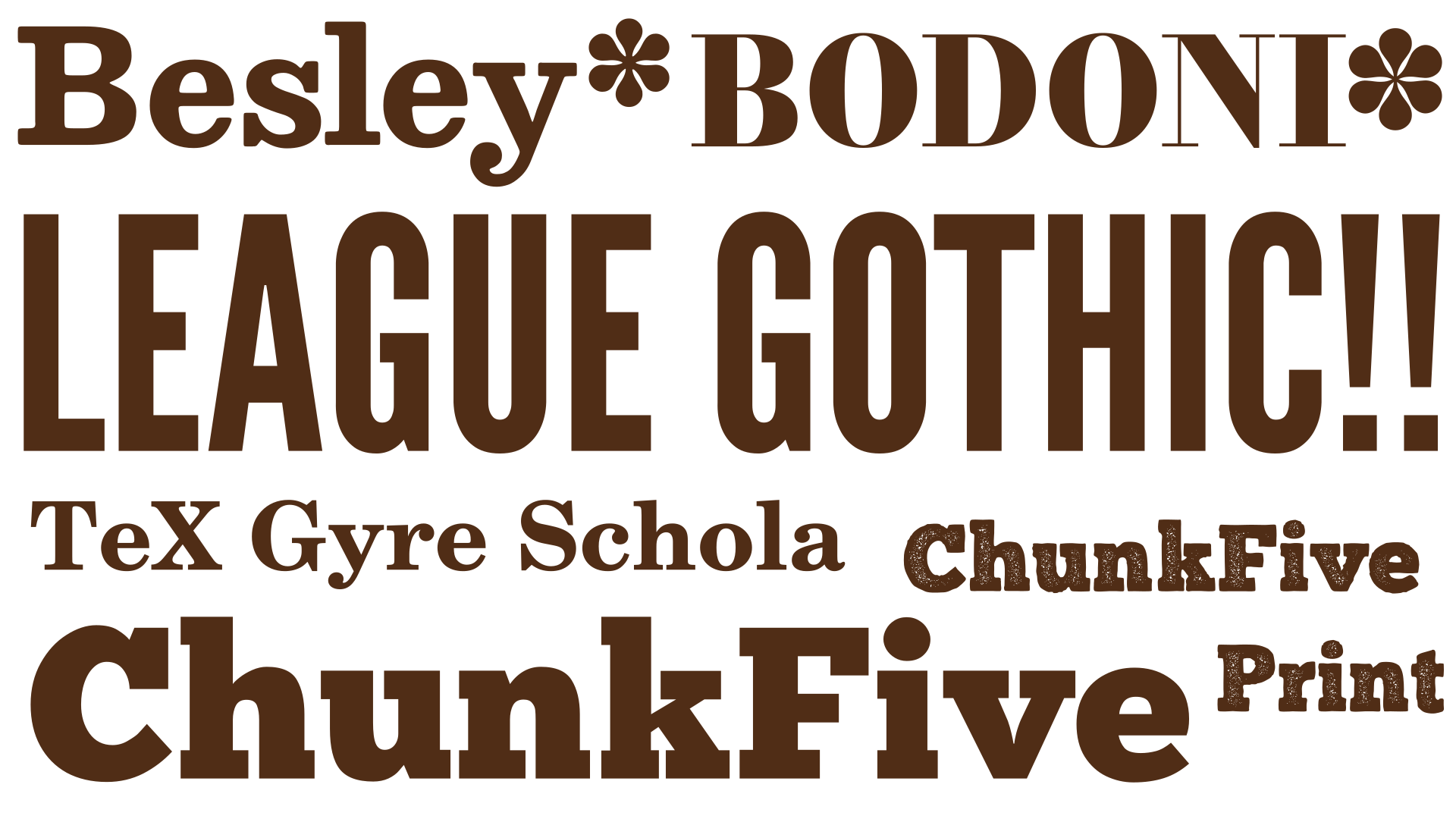
Besley* by indestructible type*
This font is inspired by Clarendon, which is one of the more iconic cowboy era typefaces. indestructible type* rounds out some of the edges (literally and figuratively) of this centuries old font to make something well suited for text. It even comes with an italic, something Clarendon neglected. The Cowboy Collective logo is written in Besley*. -
Bodoni* by indestructible type*
Don’t let its daintiness fool you! Bodoni fonts are a well-established hallmark of authentic cowboy era design. Cowboys were often seen writing entire paragraphs of text in an incredibly bold Bodoni font, which is not something I personally care for, but it goes to show to how experimental this era was. indestructible type* has included 8 different point sizes with increasingly thin strokes. I’ve personally been sticking to the 6 point because I think cowboys’ printing presses were probably a little too rough to handle such thin lines, but experimentation is always a good policy. -
TeX Gyre Schola by GUST e-foundry
Clarendon is perhaps the most iconic cowboy font, but its design is actually based on an older font design. Century typefaces date back to the 1800s and were used for writing body text, like in books. They have a very official feel, in fact a Century typeface is used by the United States Supreme Court. Cowboys were already using big, bold, “Egyptian” style typefaces, but it was the marriage of the boldness of the Egyptian with the practicality and legibility of Century typefaces that gave us Clarendon, the epitome cowboy font. A Century typeface is a good one to have when cowboys want to be more formal, legible, and pay homage to the people who came before them. GUST e-foundry is known for making high quality and very detailed free fonts. TeX Gyre Schola has nearly 1250 unique letters in it, including support for Russian and Greek! -
League Gothic by the League of Moveable Type
Another exciting invention of the Cowboy Era is the “Grotesque” of “Gothic” fonts. These were the precursor to the modern day sans-serif which has become quite commonplace, but at the time it was considered a radical and new direction. The League of Moveable Type has made a Gothic fonts that feels straight out of history! -
Chunk by the League of Moveable Type
Chunk is more of an “Egyptian” style slab serif. This was the precursor to the Clarendons as mentioned in the “TeX Gyre Schola”. They are less refined, and Chunk does a good job capturing that bold grittiness that got softened a bit in Clarendons. Appropriately, this typeface only comes with one, bold, version. No italics, no regular, just BOLD. -
Libre Clarendon by Pablo Impallari and Rodrigo Fuenzalida
Finally, the most important cowboy font of them all, Clarendon. If there is one typeface that continues to summarize all that was exciting and brilliant about this era, it’s Clarendon. The gold standard of cowboy type design. Impallari type has the best and most complete free Clarendon family. It comes with a whole series of widths from condensed to wide. Unfortunately, this project was abandoned before it was finished over five years ago. What was completed is brilliant, well crafted, and everything good type design should be. We can only wonder what this would have looked like had it been seen to completion!
Of course the MOST important thing to know about cowboys and their type design is that they were highly experiential, trail blazing, weren’t afraid to break all the rules and make a mess. Using these fonts might give your cowboy work an historical accuracy, but the true cowboy spirit is in the new! Honor the cowboys of past by pushing the boundaries, and using letters in such new and exciting ways that your contemporaries will call it “grotesque”!