Copperplate CC Font
OWEN EARL 22 June 2020
Makin’
A Historical revival of Copperplate Gothic by indestructible type*
★ DOWNLOAD THE ZIP! ★
Truth be told, I have a bit of an obsession with typography. When I’m not contributing to the Cowboy Collective, I’m making fonts over at my foundry, indestructible type*. It is only natural, then, to combine these two passions of mine and produce a series of cowboy fonts for the collective.
Thus, I am starting the Cowboy Font Revival project. My goal is to make a series of digitizations of historical typefaces that feel within the cowboy genre, and release them for free to the collective. These will be typefaces that were designed a hundred years or so ago and are therefore public domain, but for which no free digital version exists. These are not original designs, but recreations from the predigital era.
To kick this project off, I made a version of the classic font Copperplate Gothic. Designed by Frederic Goudy in 1902, these letters are an American classic. They might be familiar to you, as they have made their way onto fancy business cards, bank windows, and even the Universal Studios logo. The font is in all caps and features simple letter forms, which, in my opinion, gives it a sturdiness and a no-nonsense appeal. It also features the tiniest of serifs, and is recognizably older in its design, which makes it refined and dignified. What an attractive combo of characteristics!
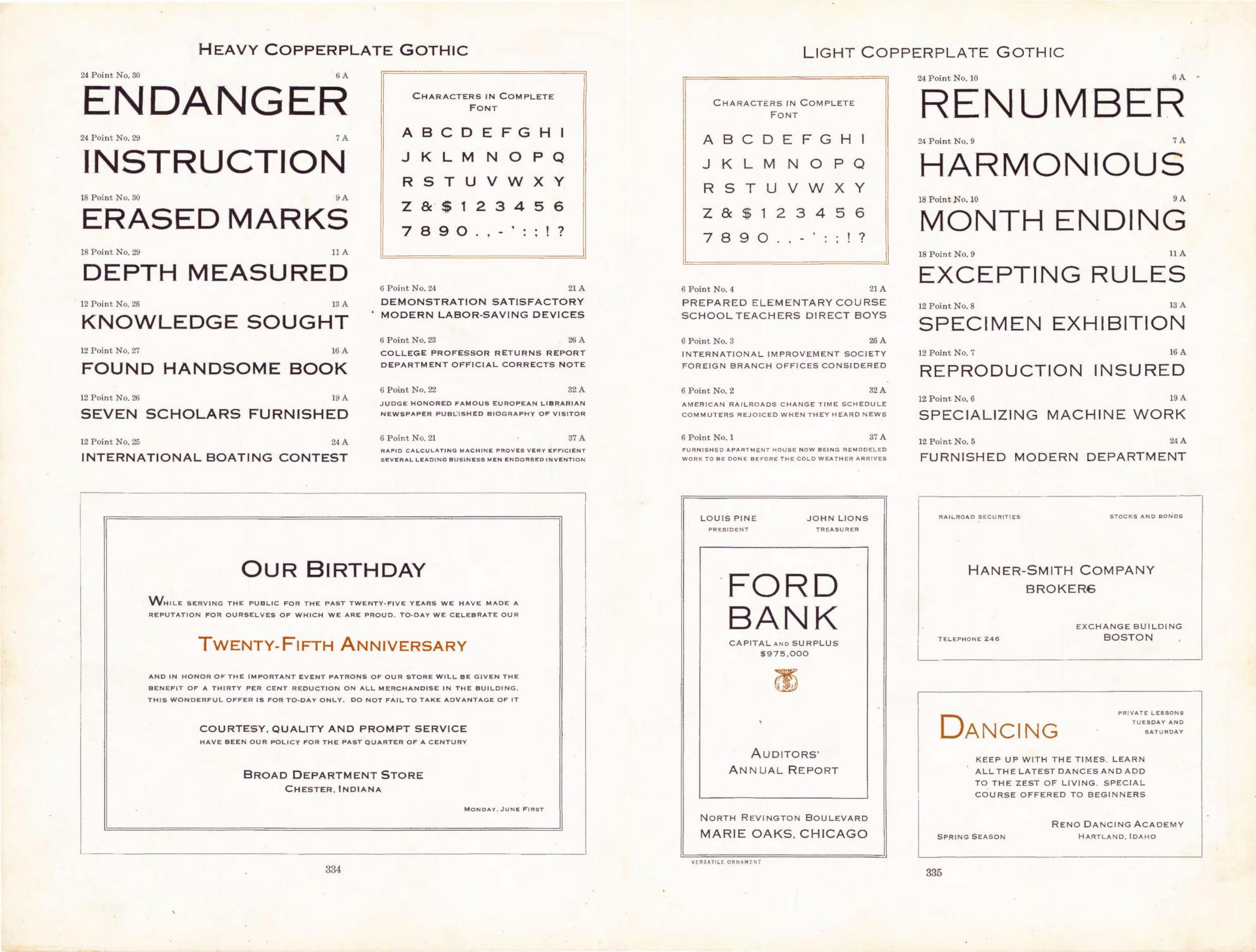 Copperplate Gothic page in 1923 American Type Founders Specimen Book & Catalogue
To stay well within our legal rights, and because this is a partially archival exercise, I looked to the original source materials for reference, instead of contemporary digital fonts. What I discovered is that the Copperplate Gothic of yesteryear is different from modern day interpretations in some surprising ways.
The serifs really are quite small, and subtle. These have been exaggerated over the years. It is a distinguishing characteristic, but some of the elegance is lost. I was also curious to learn that the original cut did not include matching small caps (smaller capitals for the lowercase letters), rather, the small caps effect is created by using a different point size. This looks sloppy to my modern-day sensibilities, but it does offer more creative freedom for the type setter as they can make their lowercase letters as large or small as they want.
Most intriguing to me were the weights. I am used to seeing Copperplate Gothic in bold, but the bold version appears to be more of an after-thought in the original release. Instead what we are given is a “heavy” and “light” version of the typeface. This can be seen in the picture above. The “heavy” version doesn’t look at all heavy to me, and the “light” is so thin it almost appears fragile.
I want to be as faithful to the source as possible, so I kept these differences, even if some of them feel unusual. This version feels closer to using a historical typeface then a historical-inspired typeface, and I will certainly feel a snickering pride knowing my Copperplate Gothic is more inline with what Mr. Frederic W. Goudy had in mind.
Letterforms in American Type Founders Catalogue vs. Copperplate CC
Of course artistic interpretation is necessary and unavoidable in a project like this. There was no at (@) or euro (€) symbol in the 1902 version, for instance, and perfectly sharp edges are impossible on analogue printing equipment so whether or not a corner is rounded or sharp is a matter of guesswork. There are some advantages digital technologies afford us as well, such as better contextual kerning. I want this font to be historically accurate, but also useful and for that reason I have included all the necessary glyphs one would need in daily use as well as contextual kerning and things of that matter. At this time I am releasing a “Heavy” and “Bold” version. Although I don’t think bold was a high consideration in the original release, it does make an appearance in the original catalogues and it is so widely popular that I felt any revival would be incomplete without it. Sometimes the graphic designers know better then the font designers.
With interest I would like to expand this family to include the “light” version as well as possibly a condensed and extended cut. In the spirit of collaboration feel free to submit an issue report if you’d like to see some new features or character support. This is SIL so it’s free to modify and redistribute and all that jazz.
Love to see what you guys do with this!