Tiffany Gothic CC Font
OWEN EARL 30 June 2020
Makin’
A Historical revival of Tiffany Gothic by indestructible type*
★ DOWNLOAD THE ZIP! ★
For the second installment in the Cowboy Font Revival project, I went to the same source as I did for the Copperplate Gothic Revival. I went snooping around early 1900s American Type Founders catalogs. There is no shortage of interesting typefaces to be found among the listings, no doubt more will grace the Cowboy Collective with their charm as I continue this revival project. However, one in particular caught my eye.
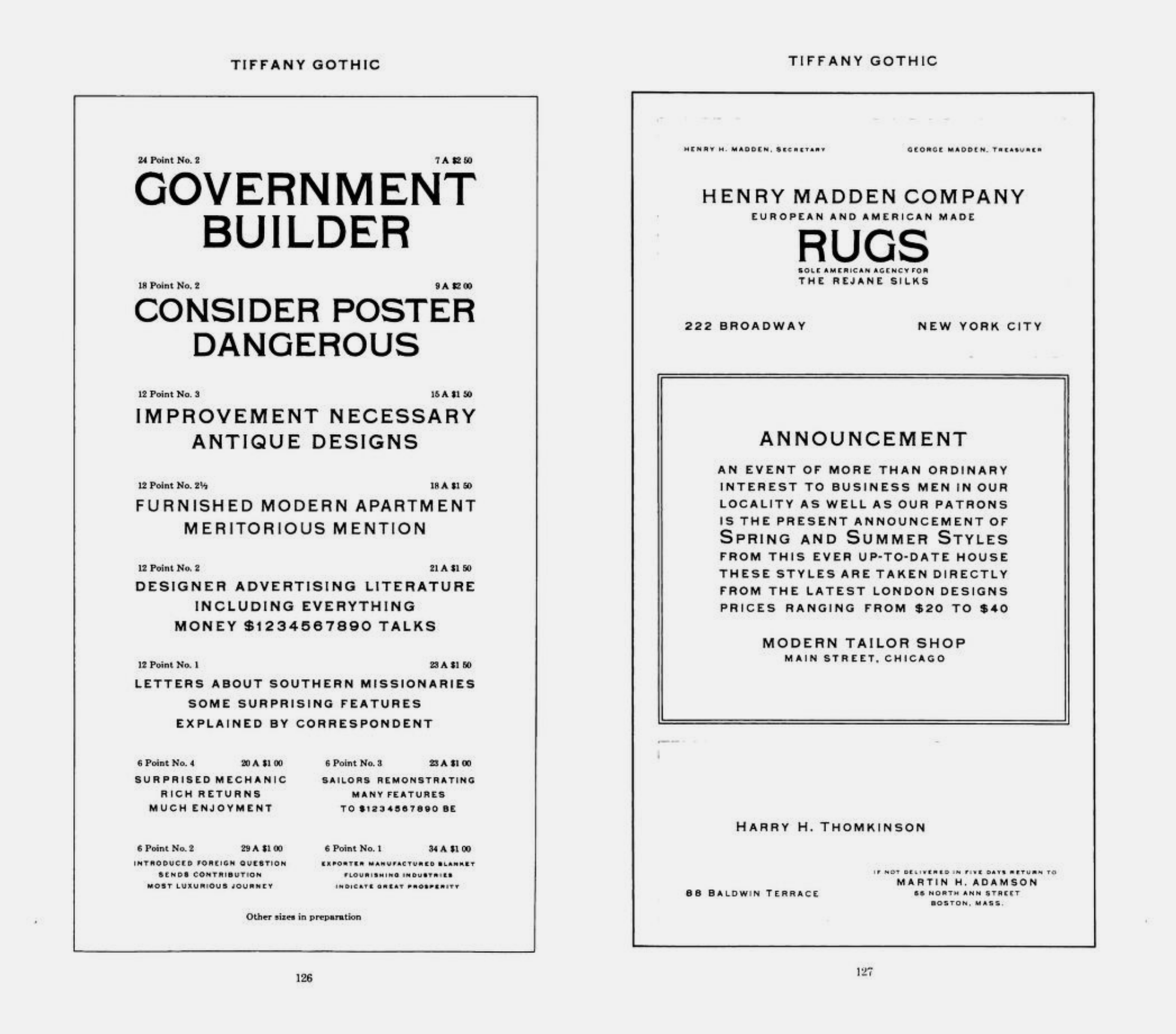 Tiffany Gothic page in 1909 American Type Founders Specimen Book & Catalogue
I was charmed, in much the same was I am with Copperplate. The letters feel sturdy and no-nonsense. They too have an elegance and dignity, with their delicate serifs. There are some interesting irregularities as well. The curved leg of the “R”, the “G” with no crossbar at 24 points but an apparent crossbar at 12, the slanted terminal to the center arm of the “E” and “F”. The quirks make the letters feel more experimental to me, and more grounded in the past.
This relative of Copperplate Gothic felt like a good place to start for the second revival project, but this specimen didn’t include all the letters, and the scan was of a rather poor quality. I needed to find more source material in order to do a proper revival.
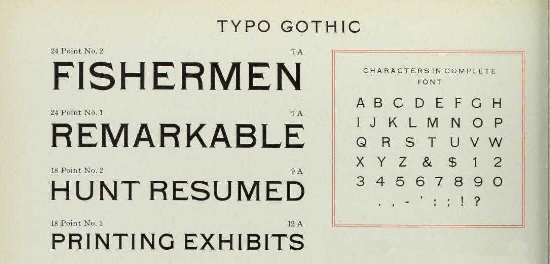 Tiffany Gothic page in 1923 American Type Founders Specimen Book & Catalogue
Perusing other ATF catalogs revealed something peculiar, it appears that between 1909 and 1923 Tiffany Gothic got renamed to Typo Gothic. This is a much worse name in my opinion. By the 1960s, ATF catalogs included listings for numerous typefaces with Typo in the name, none of which bear any resemblance to the 1923 Typo Gothic.
 Page in 1969 American Type Founders Handy Type Index
Although interesting, this didn’t help me with my digitization effort, as none of these images were of a high enough resolution to do the project justice.
Google confirmed a suspicion I was beginning to have: there is very little, if any, information about Tiffany Gothic that has made it to the digital age. No digitization effort. No articles. It seems this is a typeface lost to time. This lack of information and references rendered my work impossible.
ꞏ
I stumbled upon the delightful website of Dr. David M. MacMillan, Circuitous Root. It feels reminiscent of an earlier, more optimistic era of the internet. The site was built from scratch, and is clearly motivated by a deep knowledge and passion, not likes and shares. He’s has a certain love of metal type, and like the Cowboy Collective, most of the site’s contents are licensed under the creative commons. He also has a copy of the 1923 American Type Founders Specimen Book & Catalogue.
I wrote to David MacMillan hoping he would do me the tremendous favor of scanning the Typo Gothic page from his ATF catalog. Within 24 hours, he wrote back. Not only did he include the page in question, but also pages from the 1912 ATF catalog showing Typo Gothic, all of which were scanned at a whopping 2400 pixels an inch. The scans are available online for download, for those curious.
He also turned me on to the book American Metal Typefaces of the Twentieth Century, which includes an entry for Tiffany Gothic.
Typo Gothic is the oldest of the group, and has been made by many founders. […] The earliest showing seems to have been offered as Lining Antique by Illinois Type Foundry in 1889; Keystone Type Foundry later used the same name. Subsequently it was shown as Cleveland by Standard Type Foundry, as Standard Lining Antique by Marder, Luse, and as Olympia by Inland, all before 1900. ATF showed it as Tiffany Gothic from 1901 to 1909 and later as Typo Gothic.
I like the name Tiffany Gothic and think I’ll stick to that, but it is interesting to know how many names this typeface has gone through in its history. We know, perhaps, that these letters date back to at least the 1880s, but the specific year, as well as it’s designer(s) remain a mystery.
ꞏ
The digitization effort proved to be more challenging than that for Copperplate. Looking at the original specimens, it felt clear to me that the serifs were intended to be sharp, and come to a sharp point. However, due to the limitations inherent to the analogue process, a perfectly sharp point would have been impossible.

This is possible when working digitally. However, at very acute angles, such a thin point looks weird and creates a dazzling effect. I wanted to stay true to the original spirit, but knowing the designers were working within the limitations of their time, I couldn’t help but reason that they knew the tips would get slightly rounded in the printing process, and may have made different decisions if working with today’s technologies.

The solution was to chop off a very small portion of the tips of any point smaller then a right angle. At smaller sizes this is not even visible. It feels, perhaps, against the original design, but without this subtle change the sharp points would distract from the letters, and my goal is to digitize this alphabet to communicates the beauty without distractions.
Many such considerations took place throughout the digitization process. These letters, although beautiful, are wonky and irregular. Striking that careful balance between accounting for the differences in technology and imposing one’s own sensibilities is difficult work, and I’m not convinced I always succeeded. I will continue to revisit this digital font for the foreseeable future.
What I am convinced of, is my love of these letters. They belong in any cowboy-oriented designer’s tool-kit. They’re full of spunky character and old-timey charm, and I want to see them in use!
I’m also convinced that the Cowboy Font Revival project is even more interesting and full of surprises then I was expecting.