Engraving CC Font
OWEN EARL 18 July 2020
Makin’
A Historical revival of Engravers by indestructible type*
★ DOWNLOAD THE ZIP! ★
For the third installment of the Cowboy Font Revival project, I decided to go with Engravers Bold.
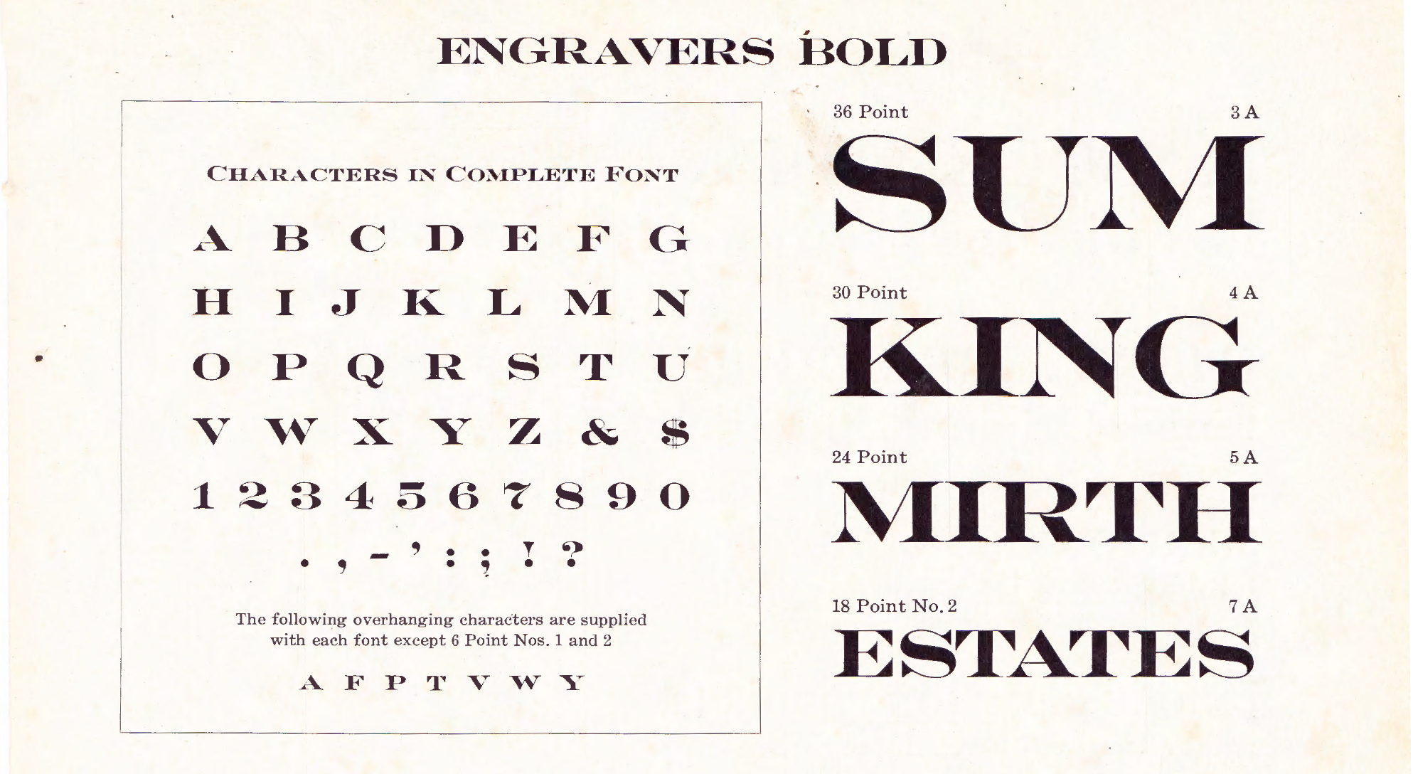 Engravers Bold page in 1909 American Type Founders Specimen Book & Catalogue
It’s an elegant font that has found its way into common usage over the years. I currently have a bottle of wine with these letters on them. I also felt unsatisfied with the current landscape of digitizations, and felt a new free digital font would be useful. However, there was another, more compelling reason for me to do these letters next.
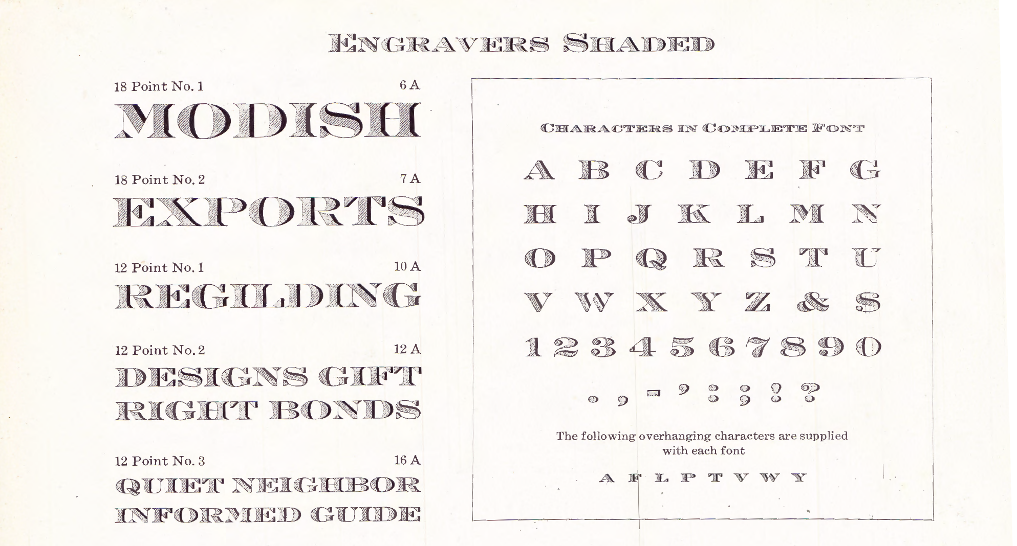 Engravers Shaded page in 1923 American Type Founders Specimen Book & Catalogue
I am fascinated by the “Shaded” version of this font. At first glance, this variation seems not that remarkable. It’s just the bold letters with portions cut out and filled in with hatching. The letterforms are largely the same, and the shaded parts are uniform.
However, the use of hatching to create more intricate detail, or a kind of three-dimensionality, touches on a large piece of our typographic past. Back in the day, intricately detailed display typefaces were commonplace. Lettering like the kind found on dollar bills or on old certificates were so common as to be unremarkable. In some instances, such as metal plate engraving, filling in large display lettering with hatching, or other line work, would be less work for the engraver than to fill the entire letter solid.
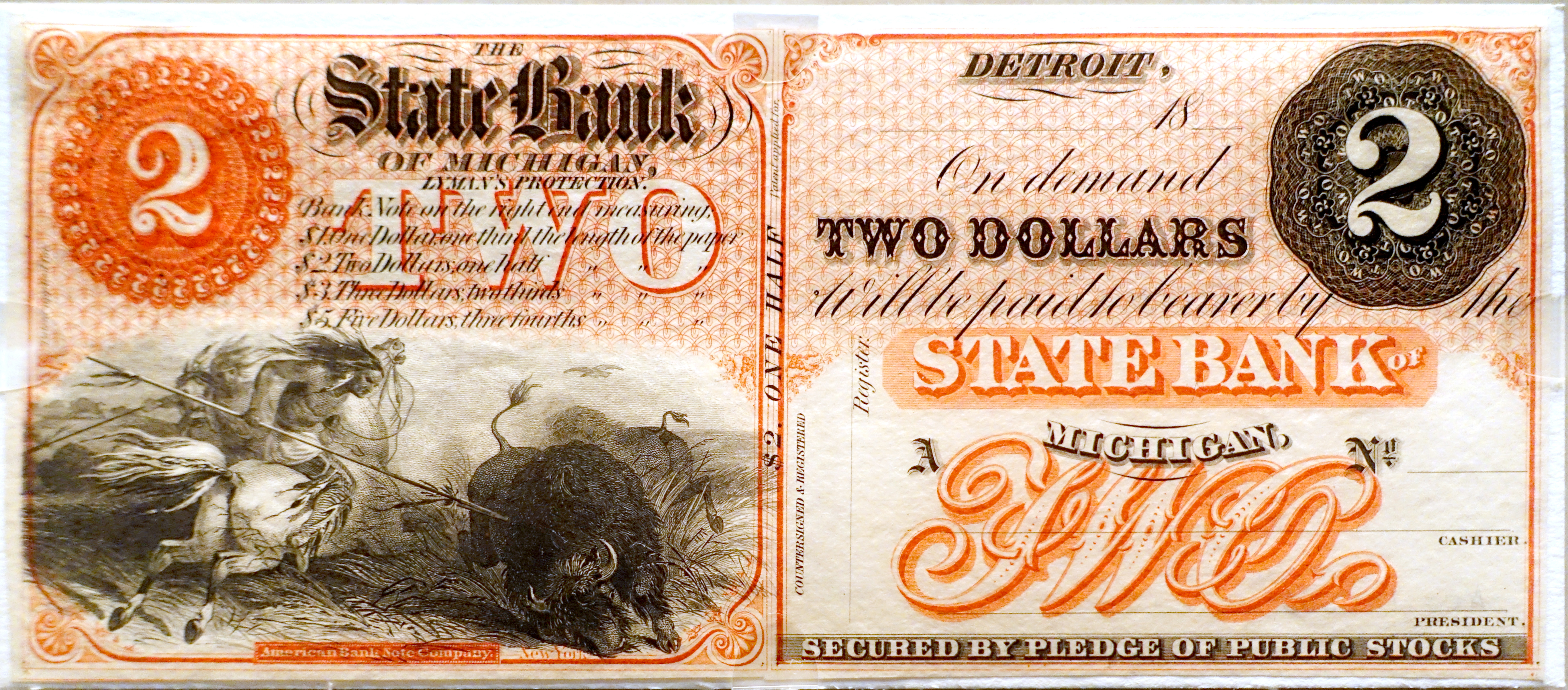 This c. 1860s two dollar bill has some amazing examples (source)
And yet, this kind of letter is largely, if not entirely, absent from digital fonts. In making a digitization of Engravers, I wanted to include a shaded version and in so doing start to explore this style of letter and why, perhaps, it has fallen out of fashion in the digital era.
I ran into the first obstacle fairly quickly. The tools are not built to accommodate this level of complexity. In a typical glyph of a digital font, there may be anywhere from 10 to 80 points depending on the letter and detail. However, every line added is another 4 points. To create the shaded effect, hundreds of little lines need to be added, which can add up to thousands of points on a single letter. This slowed my font editor of choice down considerably. A single operation, such as “select all” or “copy/paste” would take my computer minutes to complete. This is not an exaggeration. I timed it with my phone and would regularly clock in at over two minutes. Perhaps this is a short-coming of the font editing software, but more likely it is a case of proper tools being non-existent.
The second problem I ran into is the look of the font. In creating the shaded version I did a very literal interpretation of what I saw in the catalogue. Sections of the letter were cut out and filled in with a bunch of uniform parallel diagonal lines, so in my digitization I did just that. Except, computers and analog printing are very different technologies, and as discussed in my Tiffany Gothic revival, what works for one cannot always be literally translated to the other. In the case of Tiffany Gothic the sharp serif points had to be cut off to avoid a dazzling effect. In the case of Engravers there is a natural warmth that comes from the irregularities innate to analog printing. Stripped of the slight variations in line width and direction these letters feel cold, and less like a throwback to metal printing and more like something new and digital.
I’m ultimately dissatisfied but have to put it to rest. I spent over a week waiting in two minute intervals as my font editor performed a simple copy/paste operation. This is the kind of explorative work that leaves many more paths then solutions. I’m happy to share what I have now, along with my process, with the knowledge that I will pick up this path and continue forward later.
Of course I’m not the only person to play around with these kinds of letters. Typefaces like Tectónica Engraved or Obsidian explore engraved letters. Andy Clymer gave an interesting (to font nerds) talk about the design process of Obsidian. They run into the same problems I do and find novel solutions. Andy codes a new program to build the letters (thus solving the inadequate software) and uses an algorithm to vary the thickness of straight lines (thus solving the coldness). It’s worth checking out, but I’d imagine there is more than one solution to any given problem, and, as Andy makes clear, this only works for the exact type of letters he’s designing. How exciting to be exploring new typographic terrain!
I also should mention that this font is named “Engraving CC” despite it’s ATF name “Engravers”. This is because the monopolistic type conglomerate Monotype owns a trademark on the name “Engravers”. I find this questionable to say the least, how can a word as general as “engravers” be trademarkable, but I’d rather not find out the answer in court!