Railroad Gothic CC Font
OWEN EARL 20 July 2020
Makin’
A Historical revival of Railroad Gothic by indestructible type*
★ DOWNLOAD THE ZIP! ★
For the fourth installment of the Cowboy Font Revival project, I went with Railroad Gothic.
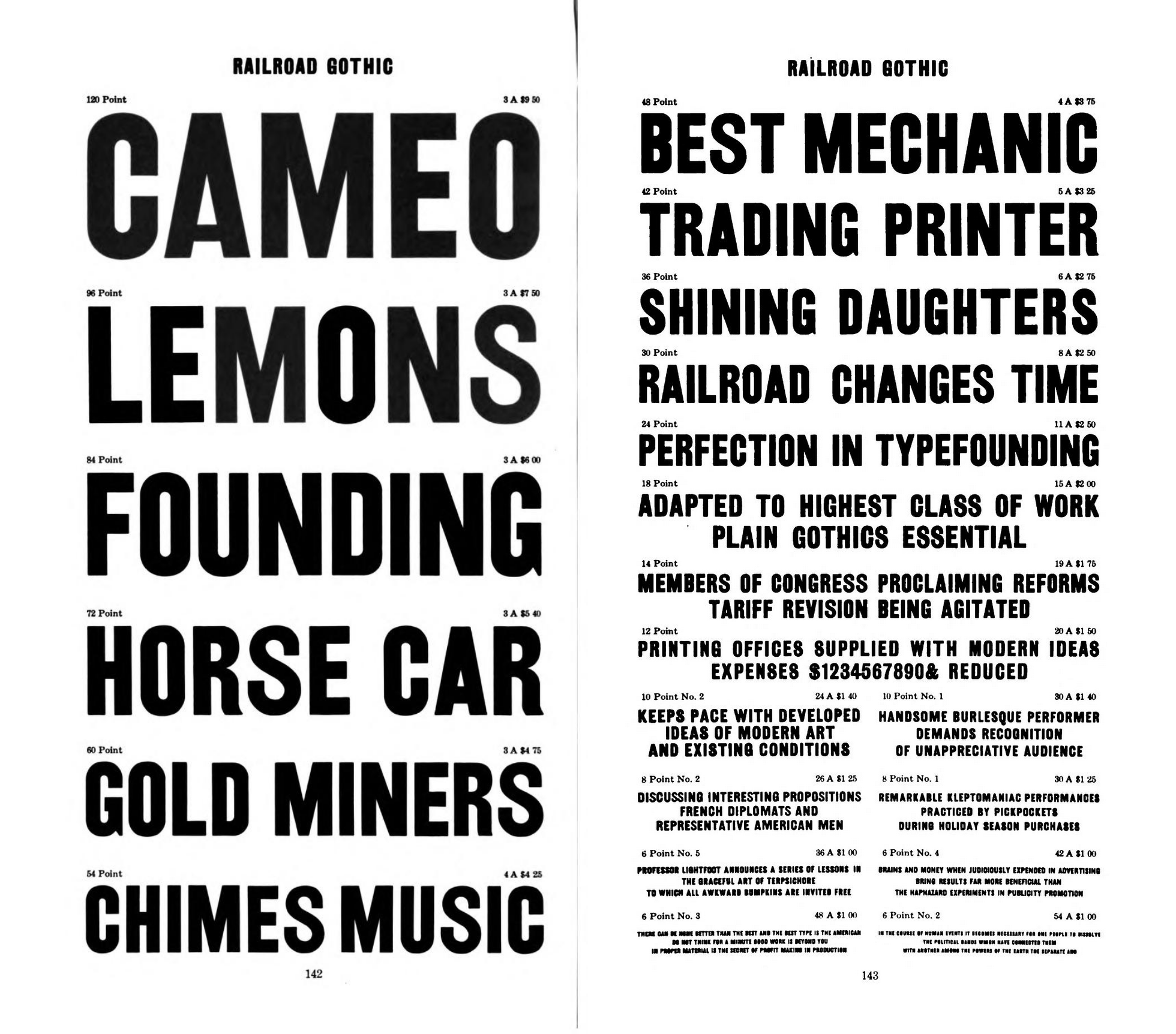
 Railroad Gothic page in 1909 American Type Founders Specimen Book & Catalogue
I think this typeface is ugly. There is a prevailing amateurish and inconsistent quality to these letters. Look at how in the above specimen the “S” appears thinner then other letters (like in the word LEMONS). Letters are even inconsistent between themselves. The crossbar in the “A” appears thin in the 120 point version CAMEO and much thicker in the 72 point version HORSE CAR. See how the white triangle created by the negative space is much smaller in HORSE CAR?
It’s as if many different similar typefaces were tossed into a box together and letters pulled out at random.
I talked in the Engraving post about how the precision of the diagonal lines leads to a lack of warmth and humanity. I wanted to experiment with the polar opposite of that phenomenon, creating something inconsistent at every turn. Railroad Gothic presents the perfect opportunity for this. Cowboys can certainly be clean and elegant, but it’s hard to think of letters that are more in line with my archetypical cowboy then a font that’s called “Railroad Gothic” whose letters are bold and ramshackle and ugly.
In prior digitization efforts for the collective, I took care to try and make the letters feel cohesive. I, by necessity, draw from different sources and in so doing end up with slight variance due to ink spread, size of the type, etc. I try and think about what the designer’s vision was, and how to achieve that best in a digital font. For Railroad Gothic I did not take this approach. I copied what I saw and did nothing to refine the letters into something cohesive.
I tried something new. Railroad Gothic has no sharp points. All the corners are rounded as if the letters are printed with cheap ink on cheap paper.
As was the case with Tiffany Gothic, there were no high quality reference images to draw from in making this digitization. Although imperfection was the name of the game with this revival, I didn’t want to just guess at what the letters looked like using low-resolution images. As was the case with Tiffany Gothic newly scanned, high quality images of the ATF catalog listing for Railroad Gothic were made.
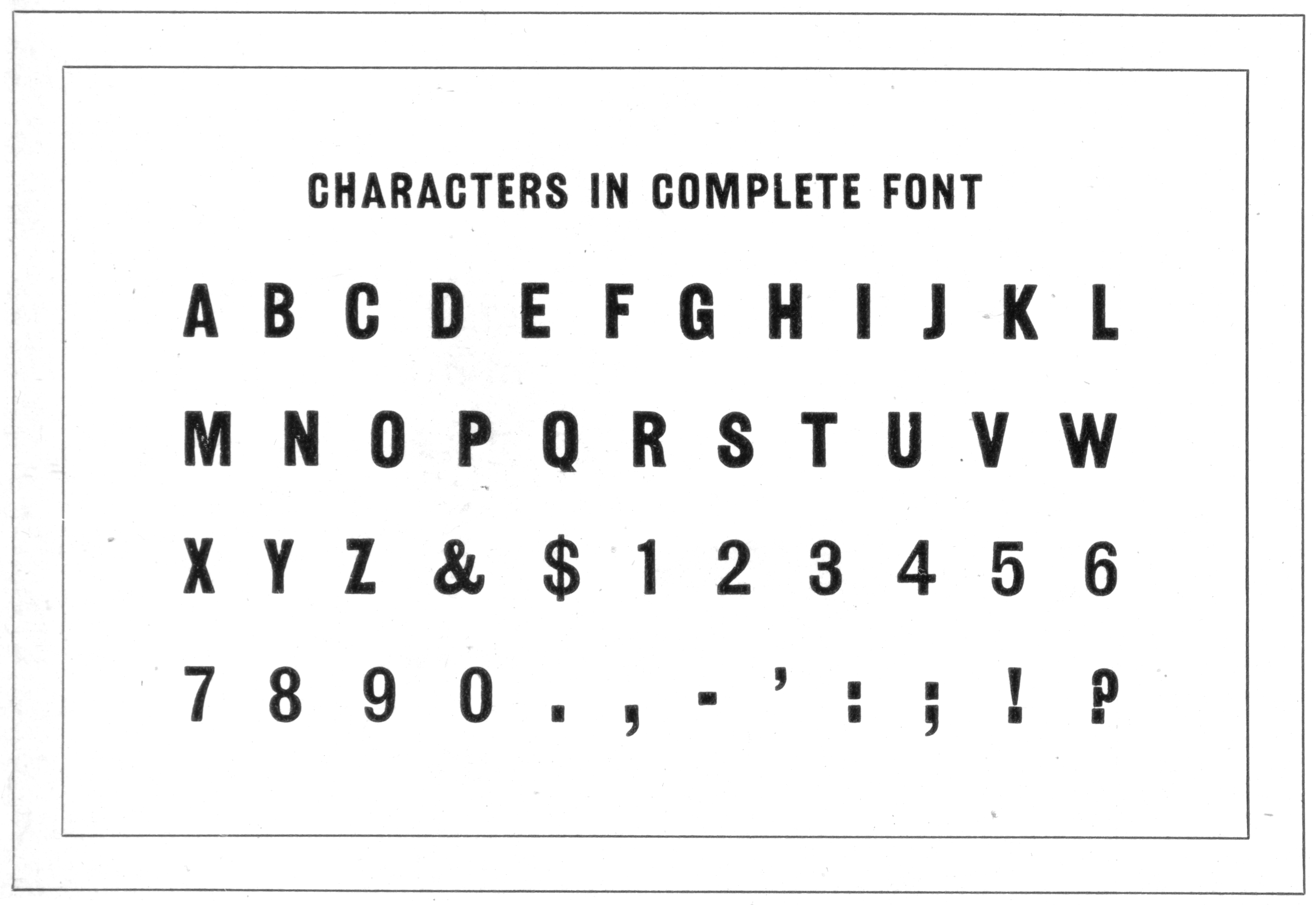
 Railroad Gothic page in 1923 American Type Founders Specimen Book & Catalogue
I think this will be the final installment in the Cowboy Font Revival project. I had a lot of fun and hope you all did as well.